This is a blog for my art class. I will post lots of info on all the things we are doing in art.

Monday, November 3, 2008

"Dream" by D. Lane Tyler


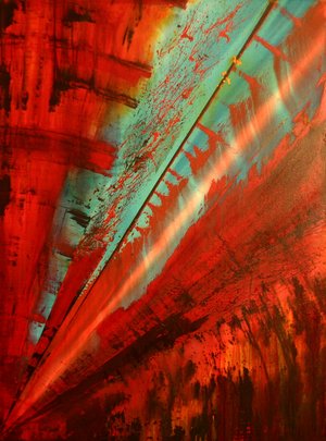
“Dream” by D. Lane Tyler is a strong bold artwork with warm tones throughout. It provides a strong message. It has a cone shape from the bottom left to the top right with warm reds at the bottom to a cool light aqua on the top with some the red from the background seeping into the blue. The background is the same as the red in the cone but it has darker brown parts ruining its harsh serenity. If we were to accociate the title with the picture, the dream would possibly be a night mare and as it leads off into its climax, the darkness fades away but you are still aware of it in the background.

Monday, October 20, 2008

Kandinsky work


Kandinsky has used tone and both warm and cool colours to say that the object or scene that he is describing has elements of sadness and happiness alike. He also has black lines crossing over the warm colours meaning that something bad may have happened. The start and end of the lines are sharp and fade in and out. He had used smooth lines to draw the shapes meaning that the object flows. The shapes are large and the smaller shapes come off one large shape. The black lines divide the shapes they are gliding over.

Monday, July 28, 2008

Margaret Preston; 'Old Bansia tree' c.1936 wood block print


This piece is by Margaret Preston and I called ‘Old Banksia tree’ though it may be perceived as a willow tree. It is a wood block print which I some of her signature ways of designing artwork. She has set the old, abandoned tree in a spot near many small dead twigs, the remains of the surrounding trees. The sky is clear with one simple cluod directly behind the tree taking up almost all of the background. The tree has streaks of light olive green running thorough it and it has many dieing leaves with the sunlight shining though them. He leaves are a yellow/orange and the tree looks haunted depending on different people’s impressions. The main focal point is the tree which is placed in the fore ground and the whole piece consists of sharp lines and cool colours exept on the leaves were you get flashes of warm colours to show differences in the work. The way that Margaret Preston had overlapped some of the branches has showed depth and how the branches on the right seep down into the ground like the twigs on the other side. This a very deep space.

Monday, June 9, 2008

Margaret Preston


Margaret Preston (1875-1963) was a widely known Austrlian artist and she was very influential during the 1920s and 1940s because of her modernist works.
MAragret decided early in life that she wanted to become an artist. In 1888 she trained with Sydney landscaper W. Lister Lister. in 1893 she enrolled at the National Gallery of Victoria Art Schoool where she studied for over four years. After she enrolled as a student at the SOuth AUstrlian School of Design, Paintinga nd Technical Arts in Adelaide in 1898. During her studies she had been influenced by the German aesthetic tradition, which emphisisdin her later works of vegetation. TIll the end of her life Preston travelled around the world studing and discovering the other waay to produce a piece of art work.

Term 2 Assignment

Our Term 2 Assignment is to use a Georgia O'keeffe or Karl Blossfeldt image and an environmental quotation to create a poster to make people more environmently aware. We must choose our picture and text carefully, being sure that the text's size and colour do not interupt the unity that they are supposed to show between us and the environment. This assignment will show if we understand the link between many different visual elements and to see if we can interpret that in our own special and unique way that ensures an effective poster.

Monday, May 26, 2008

Georgia O'Keeffe

Georgia O'Keeffe was an american artist who lived a life of 98 years.

She was known cheifly because of her paintings in which she synthesized abstraction and representaion in painting of flowers, rocks, shells, animal bones and landscapes. They all have crisp contoured forms the replete with subtle tonal transitions of varying colours.

She often transforms her subject matter nto powerful abstract matter.


She used many different forms of art including painting and charcoal to make beautiful pictures of flowers and people, which can be described as sentuous, abstract and easy on the eye.


Since 8th grade, O'Keeffe knew she wanted to be an artist.


"...I am going to be an artist"--"I don't really know where I got the artist idea...I only know that by the time it was difinately settled in my mind." She said.


In 1905 she enrolled for the School of the Art of Chicago.
She had many exhibitions in New York and became very successful.

Monday, March 31, 2008

Pizza Shop Ad

This is an ad for a pizza shop. It is horizontal. The foreground consists of a door hole is in the foreground and takes up a little bit of the picture but you are still able to see its shape. You can see a man in a door hole holding a pizza box. He is slightly smiling and has a cap on. The two main colurs in this ad are green and red. This ad is very effective!

Monday, March 17, 2008

Wednesday, February 20, 2008


This is me with my Visual Diary title page. I don't think it's that great but leave comments to let me know if you like it.

This is my main idea. It ivolves a mobile phone and I based my phone as the design!! This was only a draft and I will post the final version on here later in the term!

Wednesday, February 6, 2008

Welcome to Jamie's Visual Diary!!

Welcome to Jamie's Visual Diary. This is my website to show EVERYONE what I can do in Visual Art. I hope to continue doing this blog until I leave St Hilda's and even in university if I choose to study art. I hope you enjoy!!!

About Me